Project 3
‘Rescuing the Weak’ by Anne Perreault
Cover Design by Natasha Perreault
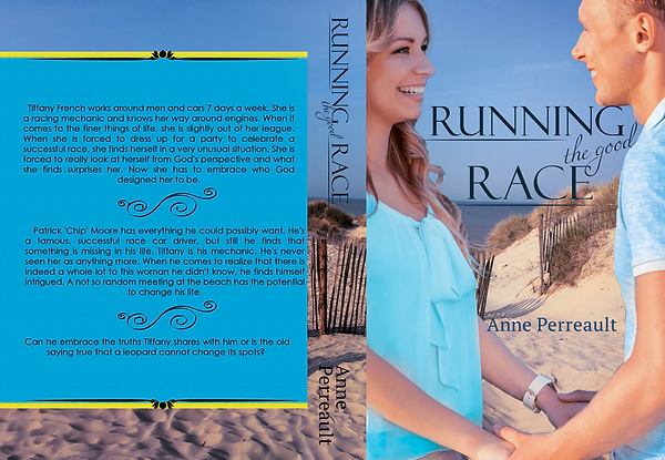
This book is a romantic book about car racing. It is a sweet story about growing closer after years of knowing each other. The book is based in Florida and the beach plays an important part in the book. Light blue gives the sense of peacefulness and renewal, which is what the book is also about. The color scheme that I kept was light blue and yellow. For this book I used two photos, one of a beach and on of a couple holding hands, smiling sweetly. In the negative space between the couple was were I placed the title and author’s name. I worked on the title in Adobe Illustrator (a vector design program). For titles I tend to draw it out on paper and figure out the shape and styles of the letters or how they would be placed before I do it onto the computer. I also look at how the text will look with the rest of the cover and if this style of text would fit with the cover. Then I move onto creating it in Adobe Illustrator. For this title the story is about car racing so I wanted to depict that. How I did this was I had capitol letters in the main text and underneath two of the lines I put two horizontal lines. To balance the boldness of the letters and to also keep the title still looking like a romance book the less important words I used a more curvy text font and tilted it slightly in between ‘running’ and ‘good’.
The background of the beach raps around the whole book jacket. Then I the switched over to Adobe Illustrator to work on the back cover. I wanted to create a blue box containing the back words so that it would stand out well. There is a yellow boarder outlining the blue border. This was to tie the background in with the front with the blue and yellow colors that can be found through out the book cover. I then split up the back cover’s words that the author wanted into three groups and placed a divider in between each one. Then I placed the title and author’s name on the spine and was done.

